 |
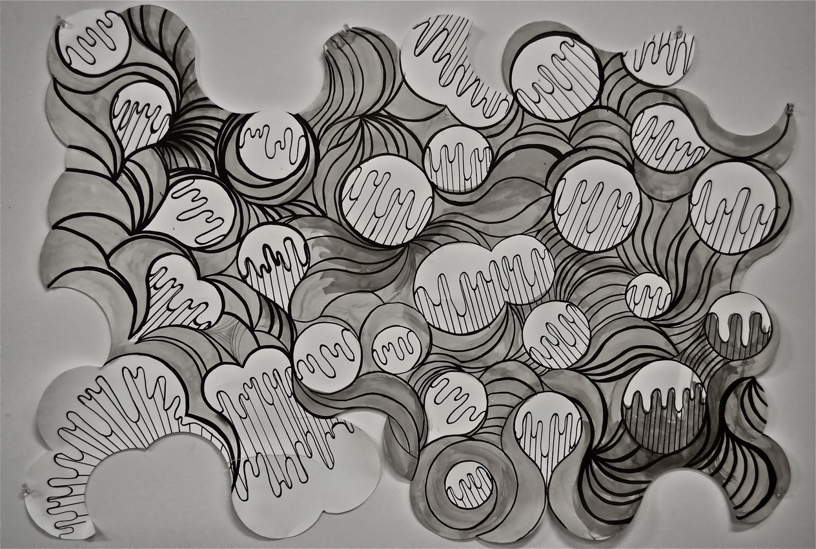
| "Groovy Blue Ridge Mountains" 30 + 44 Ink ~ "Selected Adjective + Assigned Noun" Cut Stonehenge creating a formation to directly communicate how the selected adjective feels. ~ Assigned to create an image from an abstract cut piece of paper that depicts an adjective, in this case 'groovy'. Later, create a drawing pertaining to a noun assigned at random, in this case 'Blue Ridge Mountains'. It was the goal to understand the effect of abstract shapes and composition in conveying a concept visually. ~ 2/4/14 |
Tuesday, February 4, 2014
Brainstorm

Good Composition
 |
| Outdated 22x30 Ink ~ Assignment to teach awareness in the value that composition adds to a work of art. A successful composition will add context and content to the illustrated subject through a visual interpretation. The prompt was to choose an adjective and make it a goal for the viewer to experience or understanding this through the application of composition. I chose to convey the word “outdated” through a bland composition and out-of-date subject matter. ~ 1/27/14 |
Monday, January 20, 2014
Potential Majors
Visiting Potential Majors
The weekend of January 17-19, 2014
 |
| Painting Studio 3rd Floor of Broad Street Fine Arts Building |
 |
| Craft/Material Studies Greeting Sign 2nd Floor of Broad Street Fine Arts Building |
 |
| Sculpture Department 1st Floor of Broad Street Fine Arts Building |
 |
| Photography/Film Greeting Sign 2nd Floor of Pollak Building ~ |
With the upcoming portfolio deadline rapidly approaching I decided that
it was important for me to visit my top choices and see what their facilities
had to offer. I realized that I do not want to mistakenly choose a major where
I do not feel at home in my surroundings and dedicate the next three years of
my life learning and growing as an artist in that environment. I want to have a
good insight when I select my top 3 majors in March.
I began my tour by exploring the Pollak building where the photography
and film majors are located. My friend Abigail, who had the photo project class
here, accompanied me. She showed me toured me around the facilities classrooms
and even showed me the darkroom.
I have never given photography much thought as to a potential career for
me but it something that I have always found interesting. And me being a very
inexperienced photographer who knows that I might think had I been given more
exposure to the field. While roaming the halls and getting a feel of the
environment we ran into a sculpture major whose name is also Lindsay. She was
very welcoming and offered a lot of advice to help me decipher the right choice
for me. Lindsay was previously a student of Valerie's in her surface class
during her AFO year here at VCUarts. Lindsay's advice inspired me to visit
the sculpture facilities next.
I took the short walk to the Broad Street
Fine Arts building where the remainder of my fields of interest is located. I
started from the bottom floor and worked my way up exploring the entire
building for the most part.
The first floor houses the sculpture department; I
recently had the sculpture project class in this area so I am relatively
familiar to the area. I took a few laps around the cages and peeked my head
into the wood and metal shops.
The next level is where the craft and material
studies studios are located. I never gave this major much thought before but I
wanted to check see what it has to offer out of curiosity. Roaming the hall I
saw a lot of clay and the glass blowing facility that was really interesting. I
had a small conversation with a faculty member who was working on a few of her
pieces in the grad student studio for an upcoming show of hers. Her pieces,
along with the works in progress scattered among the room, were very
intimidating. It is hard for me to believe that I would ever be that talented.
On
the next level is where painting is located, this is the field that interests
me the most. I have always had a strong connection with painting and I am
strongly considering selecting this as my major of choice for the upcoming years.
I have toured this hallway before but now that making a decision is becoming a
reality I wanted to view the space with a fresh set of eyes.
~
1/20/14
Wednesday, January 15, 2014
Bad Composition
 |
| Boring Still Life 22x30 Ink ~ We were given this assignment to help develop an understanding of composition by practicing and seeing the effect that results from a poor compositionally drawn image. As a class we created a list of typical ‘no-no’s when referring to composition including; poor placement, awkward cropping, an imbalance of subject matter, the list goes on. From the list we were challenged to break as many of these “rules” as we could in a single artistically well-drawn illustration. The outcome of the finished illustration proved us with first hand evidence of how crucial planning and attention to layout is in achieving successful artwork.
~
1/14/14 |
Subscribe to:
Posts (Atom)